whatsapp


WELCOME TO ECO HOUSE !WELCOME TO ECO HOUSE !WELCOME TO ECO HOUSE !


News
16/03/26
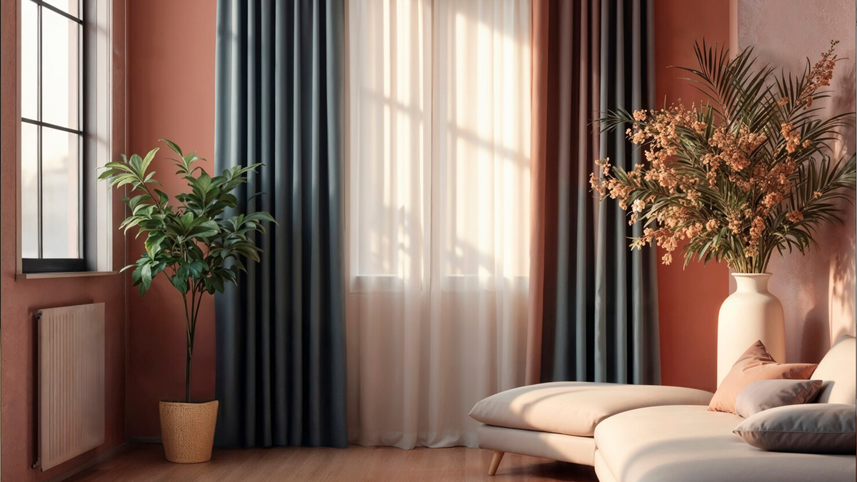
Curtain Colours for PVC Windows: Palette of Perfect Combinations
Choosing the right curtain colour for PVC windows is a delicate balance between aesthetics, psychological perception and practicality. A well‑selected shade will not only enhance the interior but also adjust the visual proportions of the room, influence the mood and emphasise the window opening’s advantages.
Start by considering the room’s lighting. In spaces with plenty of sunlight (south‑facing windows), cool tones — such as blue, mint or lavender — create a fresh feel and slightly tone down the brightness. For poorly lit rooms (north‑facing windows), opt for warm hues: beige, peach or golden. These add coziness and visually “warm up” the space.
Match the curtain colour to the overall interior palette. A universal choice is shades that echo the main colours of the finishes or furniture. Contrasting solutions (for instance, deep‑blue curtains against light walls) create a focal point but require caution: make sure they don’t overwhelm the visual balance.
Take the colour of the PVC profile into account. A white profile is versatile — it pairs with almost any tone. A coloured profile (wood‑effect, grey or black) calls for more precise matching: it’s best to choose shades from the same palette or ones that harmonise with it. For example, a “oak” profile goes well with beige, brown or olive curtains.
Room size also matters. Light‑coloured curtains visually expand the space, making it feel airier and lighter. Dark and saturated tones add intimacy but may “shrink” a small room.
Don’t forget about practicality. Light fabrics show dust and minor imperfections less, while bright and dark shades better conceal fading. For kitchens or children’s rooms, pick colours that mask potential stains — terracotta, grey‑green or muted burgundy.
What windows do you like the best?
Which kind of windows would you prefer If you were going to replace the old ones in your house or apartment?
Eco House Joint Stock Company partner of Deceuninck Group | Copyright 2009-2026. All rights reserved.
E-mail: info@ecohouse-eg.com, tel.: +201212288828
Site www.ecohouse-eg.com is for informational purposes only and under no circumstances is not a public offer. For more information on the cost of materials, products and services, please contact the sales offices